During my tenure at Plated, I largely focused on initiatives aimed at improving customer retention. One of the metrics we paid close attention to was order rate, or how many orders were placed in a given week. Over time we noticed distinct spikes in order rate on certain weeks. Members of the product and product design teams would say, anecdotally, “well, yeah, that was a really good menu.” It seemed obvious, but many other factors could influence order rate: marketing and acquisition tests, users’ personal schedules, even weather. Could we say that some menus were plainly better than others?
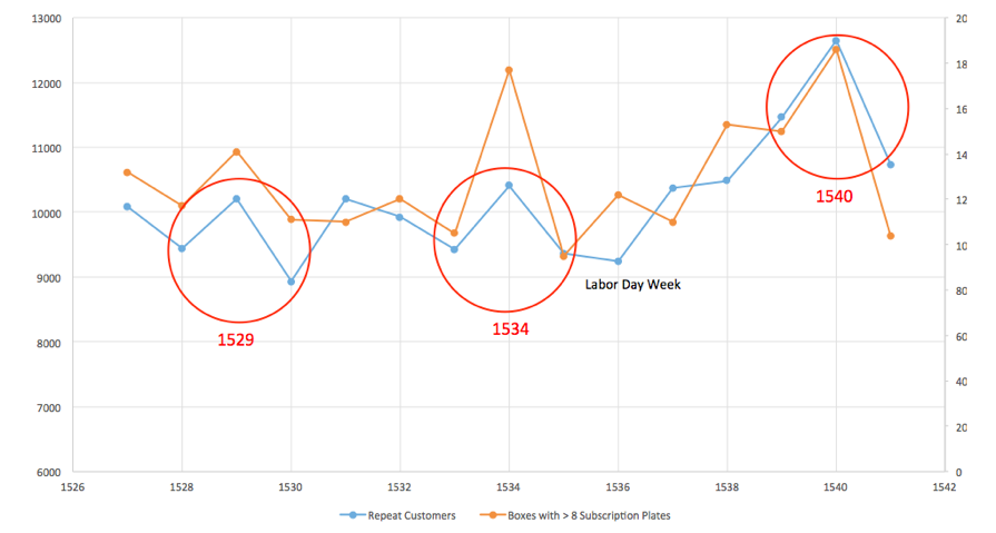
A dashboard in Tableau showing spikes in order rate on certain weeks. X Axis represents weeks, Y Axis represents number of orders placed.
To understand aberrations in order rate, we sent a weekly survey to customers who didn't order in a given week and asked about their motivations.
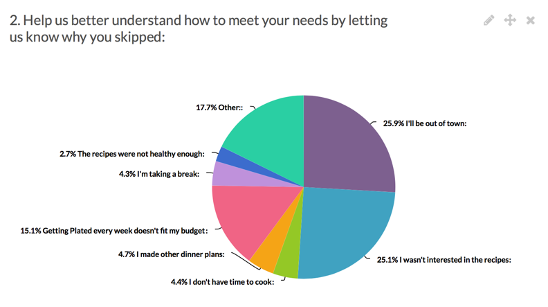
A breakdown of reasons that users provided for skipping a given week’s delivery.
The responses to our survey showed that as many as 1 in 4 users who skipped a delivery simply didn’t like that week’s menu.
The other ~75% of responses were personal lifestyle reasons that were much harder for us to control, but the menu was squarely in our wheelhouse. With lifestyle factors being fairly constant, were the peaks and valleys in order rate correlated to how appealing or “strong” a menu was? Suddenly we had a pretty strong hypothesis to test.
If we can understand and improve menu strength, then we will improve order rate.
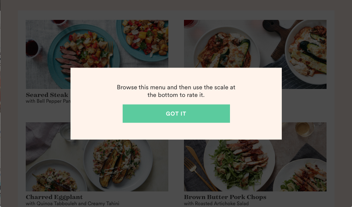
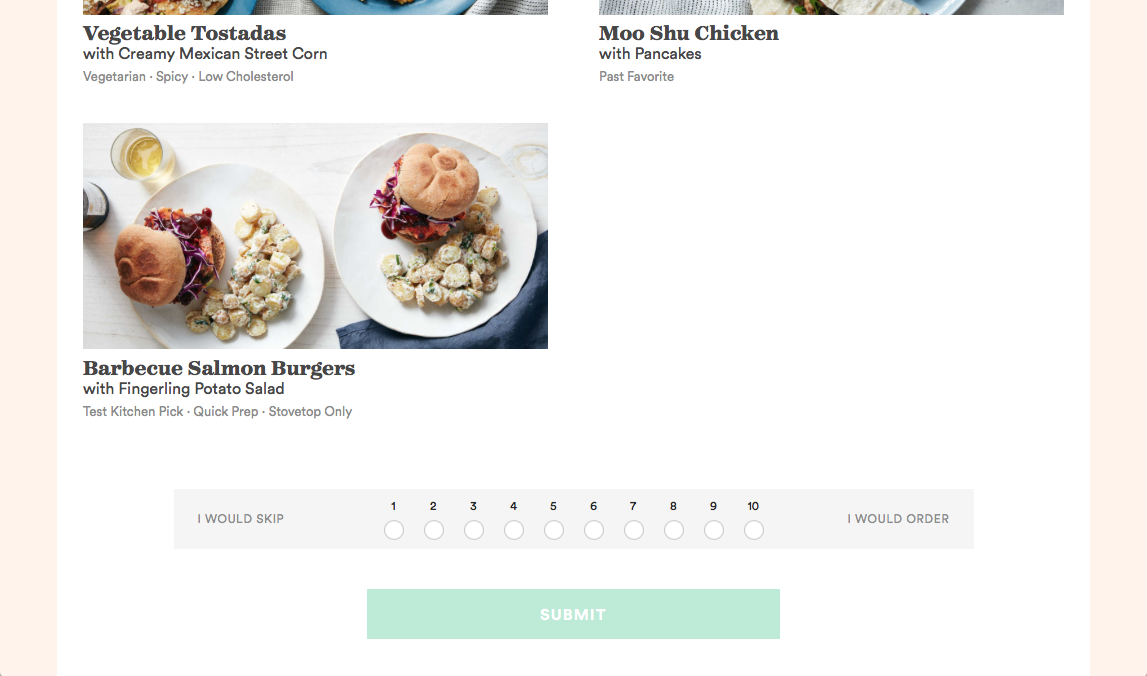
The biggest challenge was whether we could get a predictive read on how a menu would perform. To this point we’d only ever been able to look back at menus that didn’t perform well once they’d already cycled through. I partnered with our data science team to create a Google form survey that replicated the experience of browsing a menu and deciding “Skip or order?” If the survey results matched how a menu had actually performed, then we could use a similar method to predict menu strength for menus in planning.
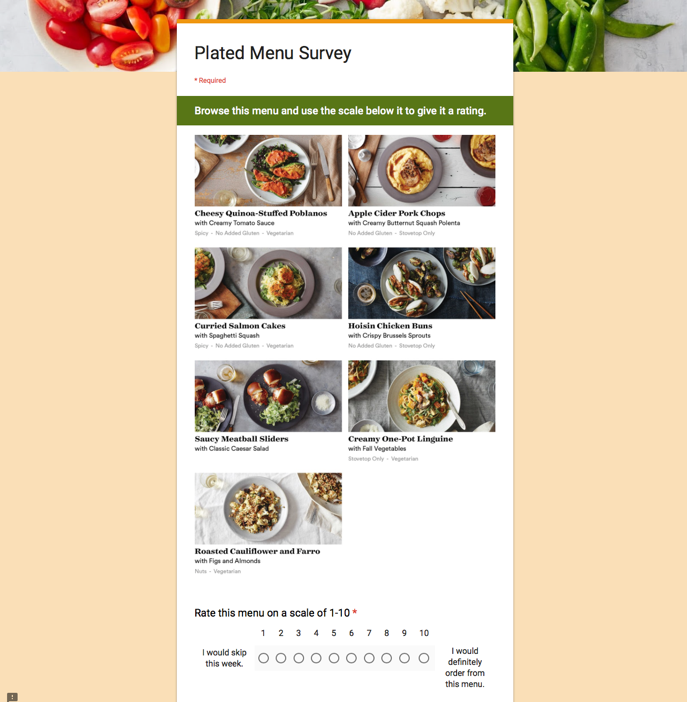
A Google form survey asked participants to browse a sample menu and then rate it according to whether or not they would order from the menu.
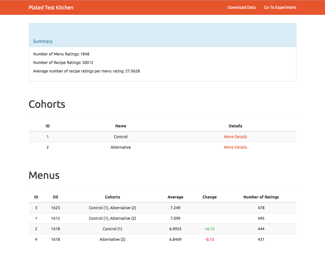
When we ran the survey with four past menus, we found that the ratings correlated with how the menu had actually performed. This was powerful stuff, but in order for it to be useful, we had to make the data actionable for our culinary team. It wasn’t enough to know that a menu was going to flop, we needed to know which specific recipes were weak links so that our chefs could make substitutions.
Our next iteration of the survey showed users a random sampling of recipes from the four menus we’d tested. We wanted to confirm that individual recipe scores did in fact correlate to the strength of an entire menu.
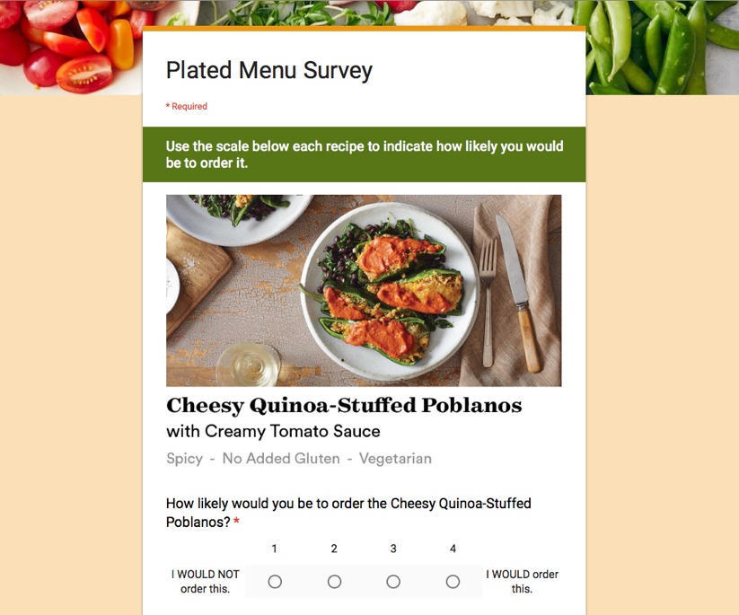
A second survey was designed to validate whether individual recipe scores correlated to a menu strength score.
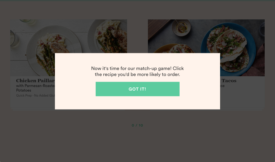
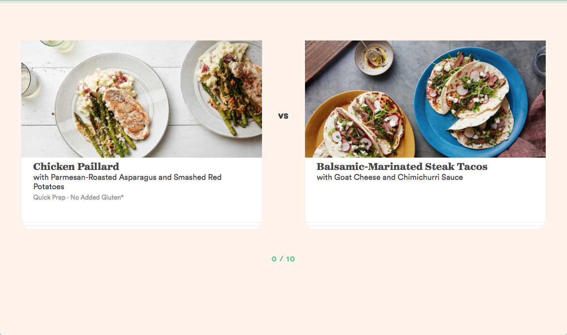
We analyzed the responses and found that menus with weaker individual recipe scores also had weaker menu scores. With that, we were ready to build our own version of the survey that could integrate with our culinary team’s planning tools. After deliberating with our data team, we decided to simplify the interface. Instead of rating each recipe, we presented two recipes at a time and asked users to pick which they preferred. This pattern was faster and more fun to interact with, and the act of comparing was more accurate to how customers would actually choose their recipes.
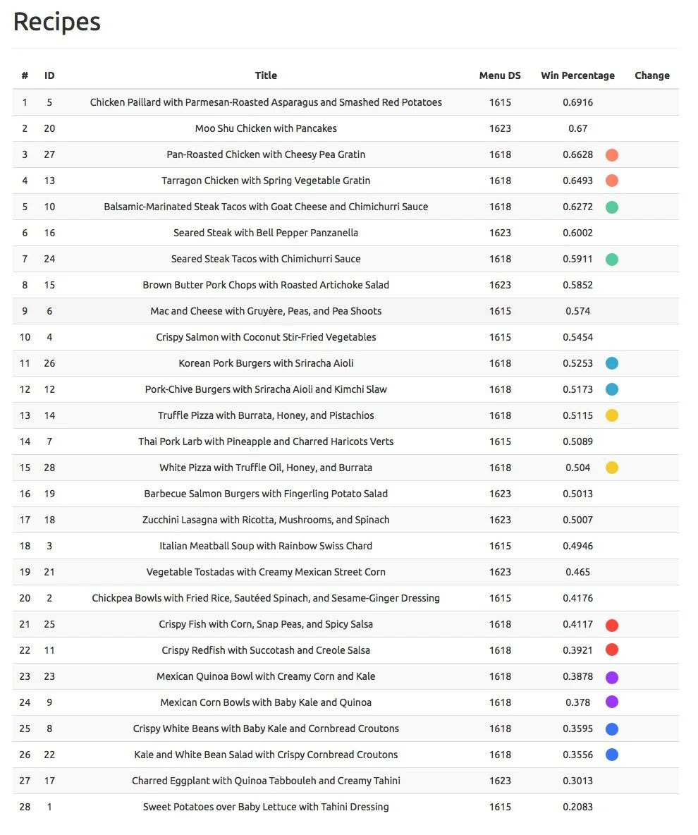
We also designed a basic administrative dashboard that would allow the product and culinary teams to run experiments. Armed with this new tool, the culinary team could test future menus and make tweaks to improve them. As an example, our chefs had a theory that when users purported to not like a recipe, it could be that the name was too complicated or unfamiliar. They used the tool to design an experiment testing out simpler names for some recipes. It turned out that the new names didn’t impact popularity, but this experiment paved the way for other interesting tests.