
When I joined Plated, a meal-kit startup, in 2014, we had a major problem with customer retention.
We were operating as an à la carte e-commerce service. Users could choose their recipes, add them to a cart, checkout, receive their box, and walk away. This low-commitment model was appealing to the meal-kit curious, but created friction for those who wanted to cook with us every week.
In the myriad meal-kit comparison articles written at the time, Plated ranked highly in recipe quality and flexibility.
Plated definitely had the most flexibility and choices, making it optimal for people who like a lot of variation or have dietary restrictions. –Business Insider
Despite the praise, Plated was struggling behind the scenes. Our two-week retention rate was between 6.5 and 12%.
Said differently, for every 10 people who tried Plated in a given week, only 1 came back to order again a second week. From a financial standpoint, this was unsustainable. We had to pivot to a weekly subscription for the business to stay alive. To do that, our entire digital experience would need to change.
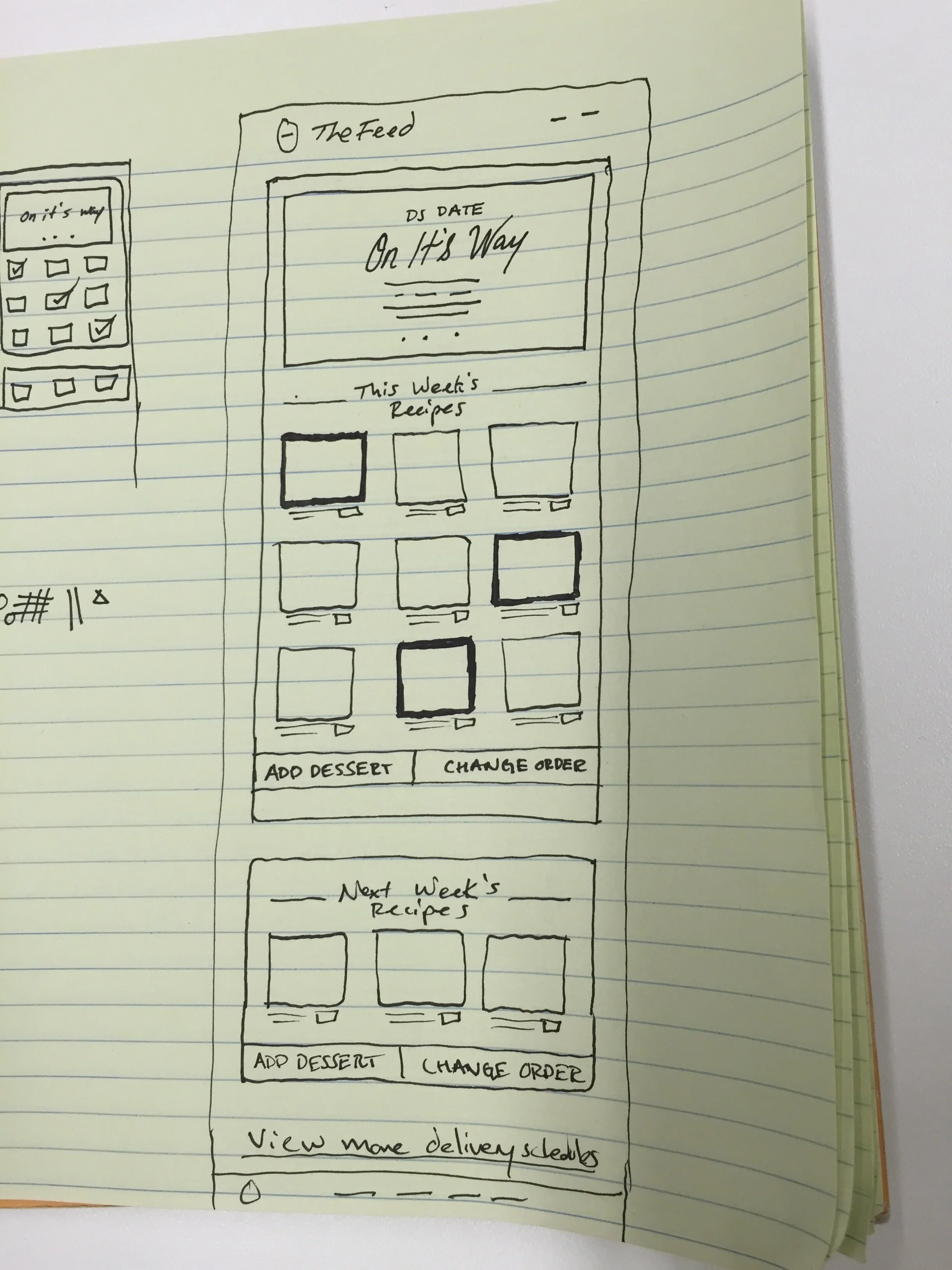
One of the first things we worked on was the homepage and onboarding experience. If we were going to operate as a subscription, it had to be clear that users were setting up an ongoing plan with us, and not placing a one-time order. My product manager and I hit the streets with paper prototypes. We tested several versions each day on strangers in Whole Foods and La Colombe.
Paper prototypes for a subscription onboarding experience
We learned tons from our prototypes as well as our support team, who was fielding constant complaints about the current website. To diversify our audience and learnings, we also set up a customer advisory board. To avoid the New York bubble bias, the board was made up of 15 loyal customers from across our national service area. We connected with these customers via video chat and surveys to test prototypes and concepts for the subscription model.
The developers started on the new onboarding experience, while the product team shifted focused to the real meat (heh) of the problem. What was the most frictionless and fun way for our users to manage their subscriptions? I’ve included some highlights from the old experience below.
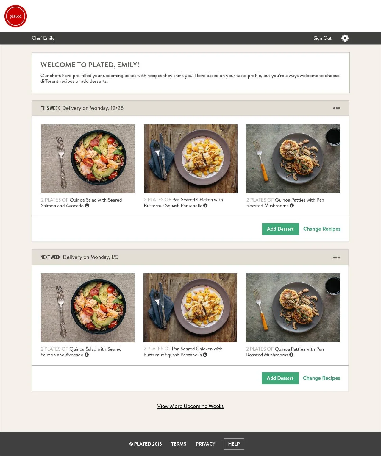
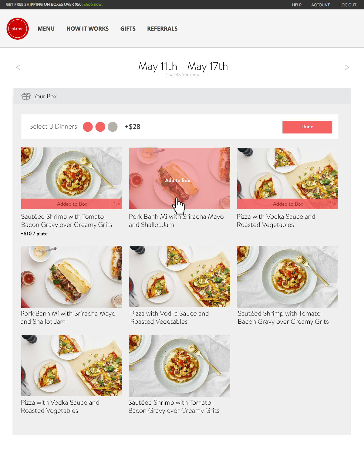
The Old Experience: Plated’s E-commerce Menu
To order from Plated, a customer would have to enter their zip code, choose a delivery date, add recipes to their basket, then go through a check out flow and enter their shipping and billing information. This was somewhat tedious, and created friction that prevented customers from placing more frequent orders with us.
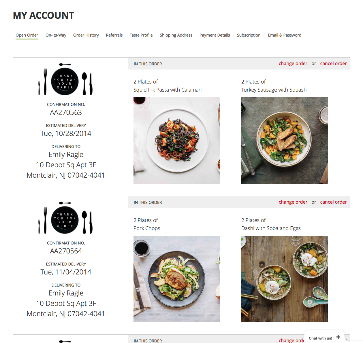
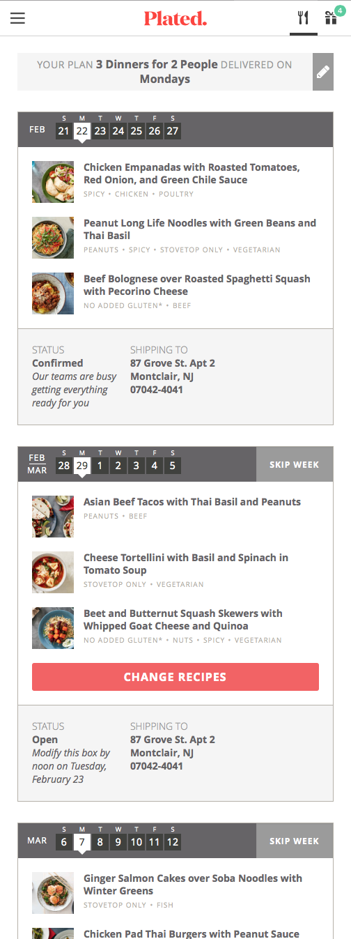
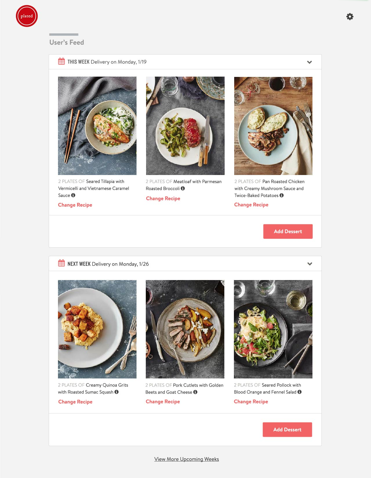
The Old Experience: Order Management
To manage or change an upcoming order, a user would navigate to their account settings. The interface there had a very different interaction pattern than the one used to place the order. Users found it unwieldy and hard to find.

After dozens of sketches, usability tests, and prototypes, we had landed on an MVP experience that we could iterate into and beyond. The major components were:
A chronological feed-like experience where a user could vertically scroll through their upcoming weeks of deliveries and plan ahead
A menu experience where users could see the recipes we had chosen for them based on their preferences, and easily swap them for other recipes on the menu
As a note: we went through a rebrand in the time since we completed this project. I’ve included the most recent version of the screens that I had available. This is not what it looked like the day we launched, but the fundamental features and layout are largely the same.
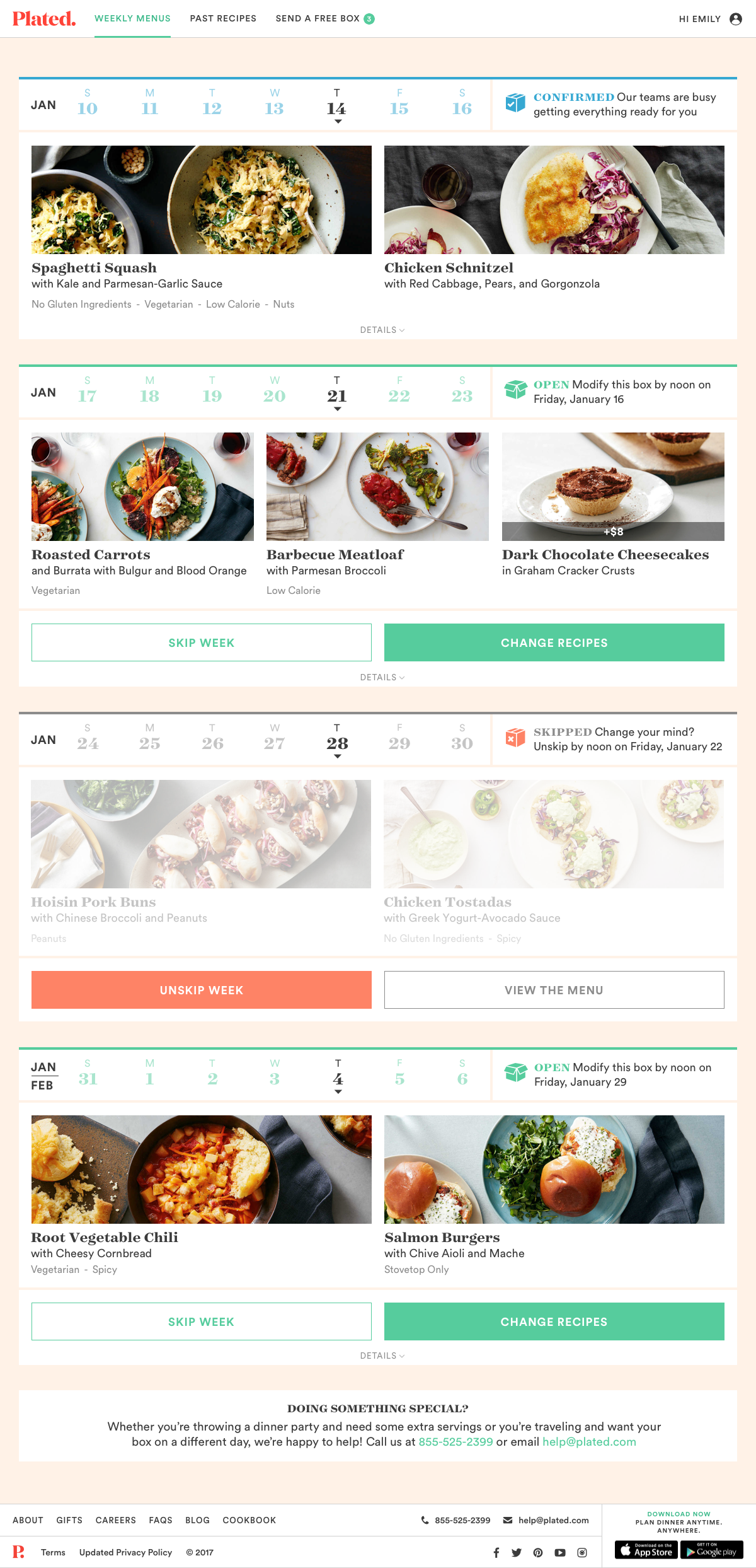
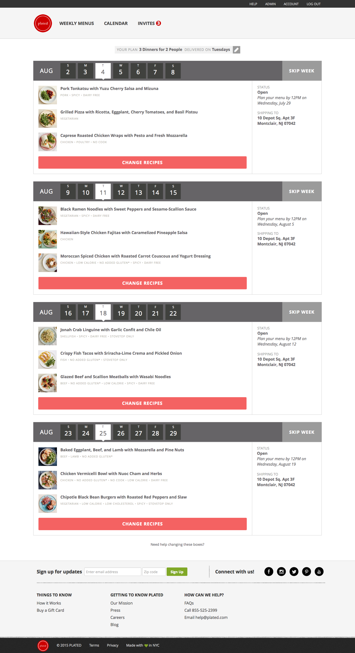
The New Experience: Easy Subscription Management
Subscriptions don’t have to be scary. It’s important that users have full visibility into what is coming and when, so that they can plan ahead and avoid surprises. It was a top priority to make skipping weeks and swapping recipes as simple as possible.
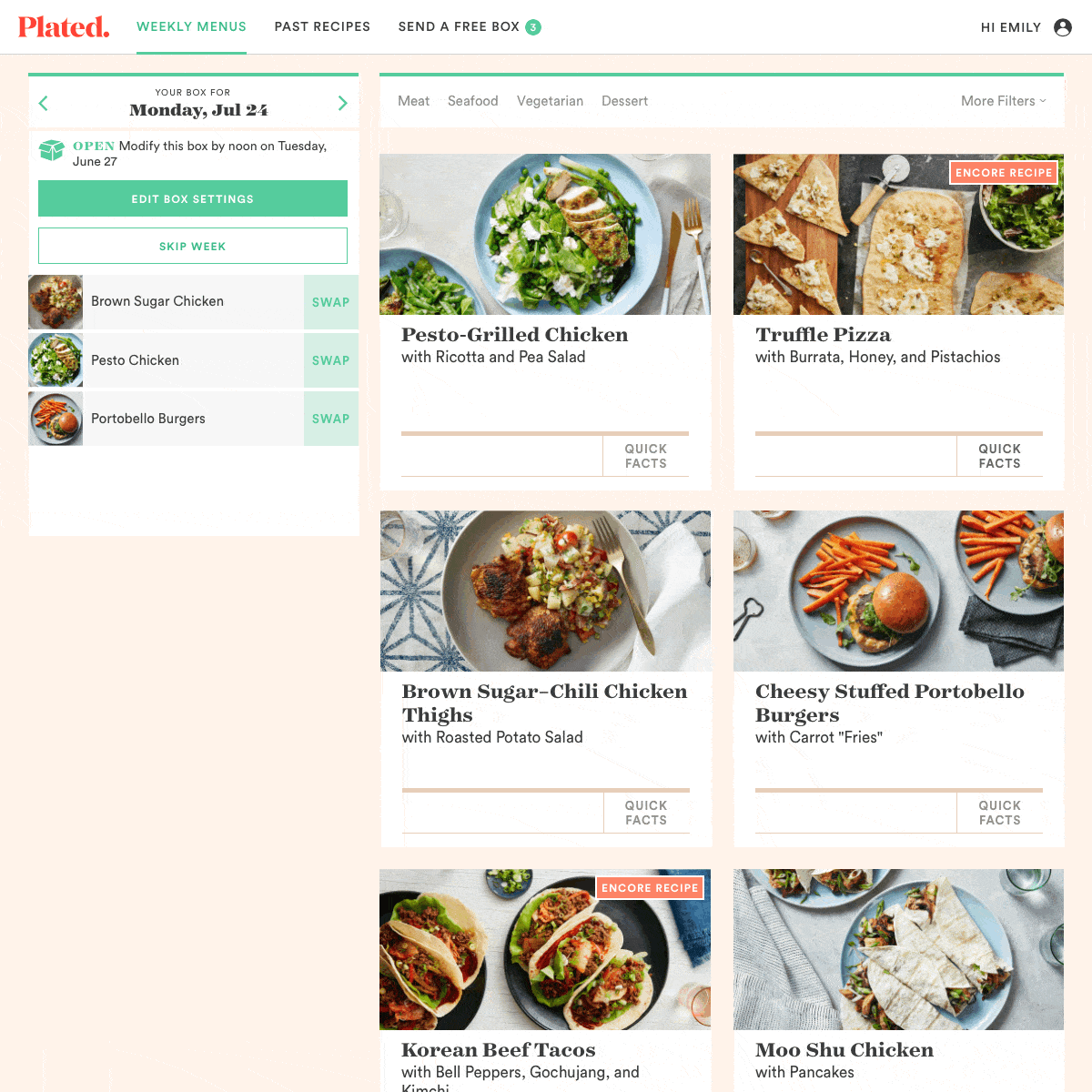
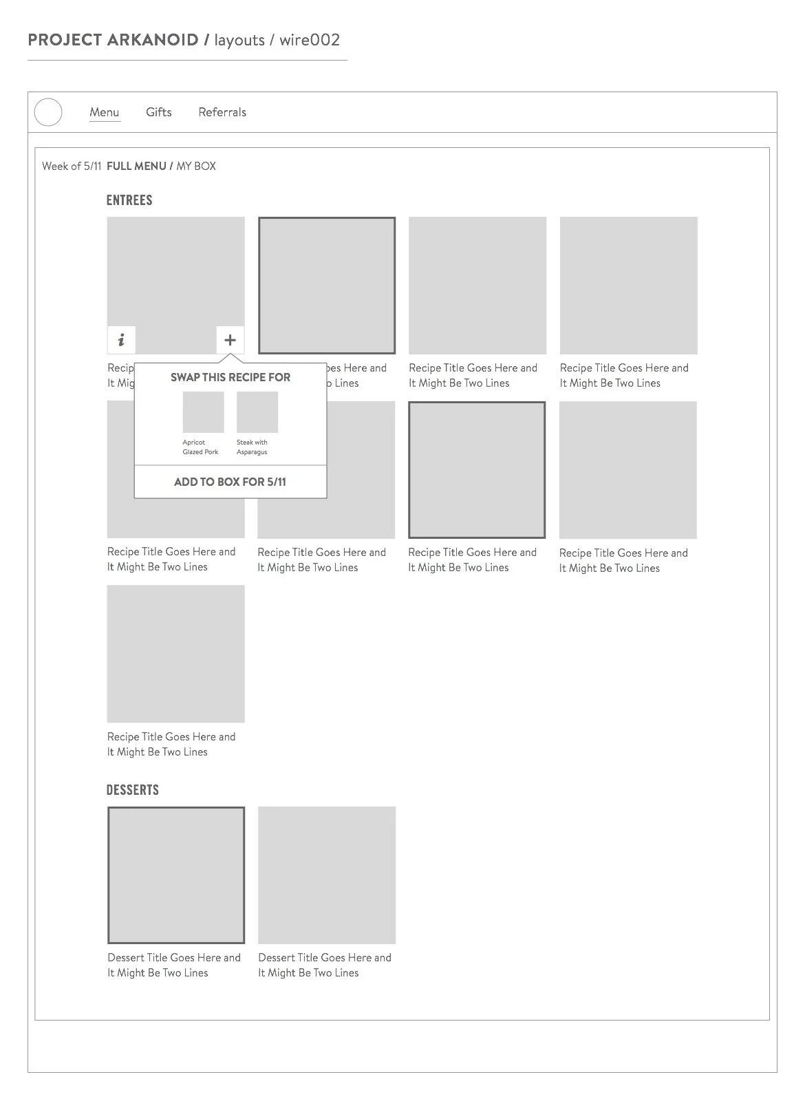
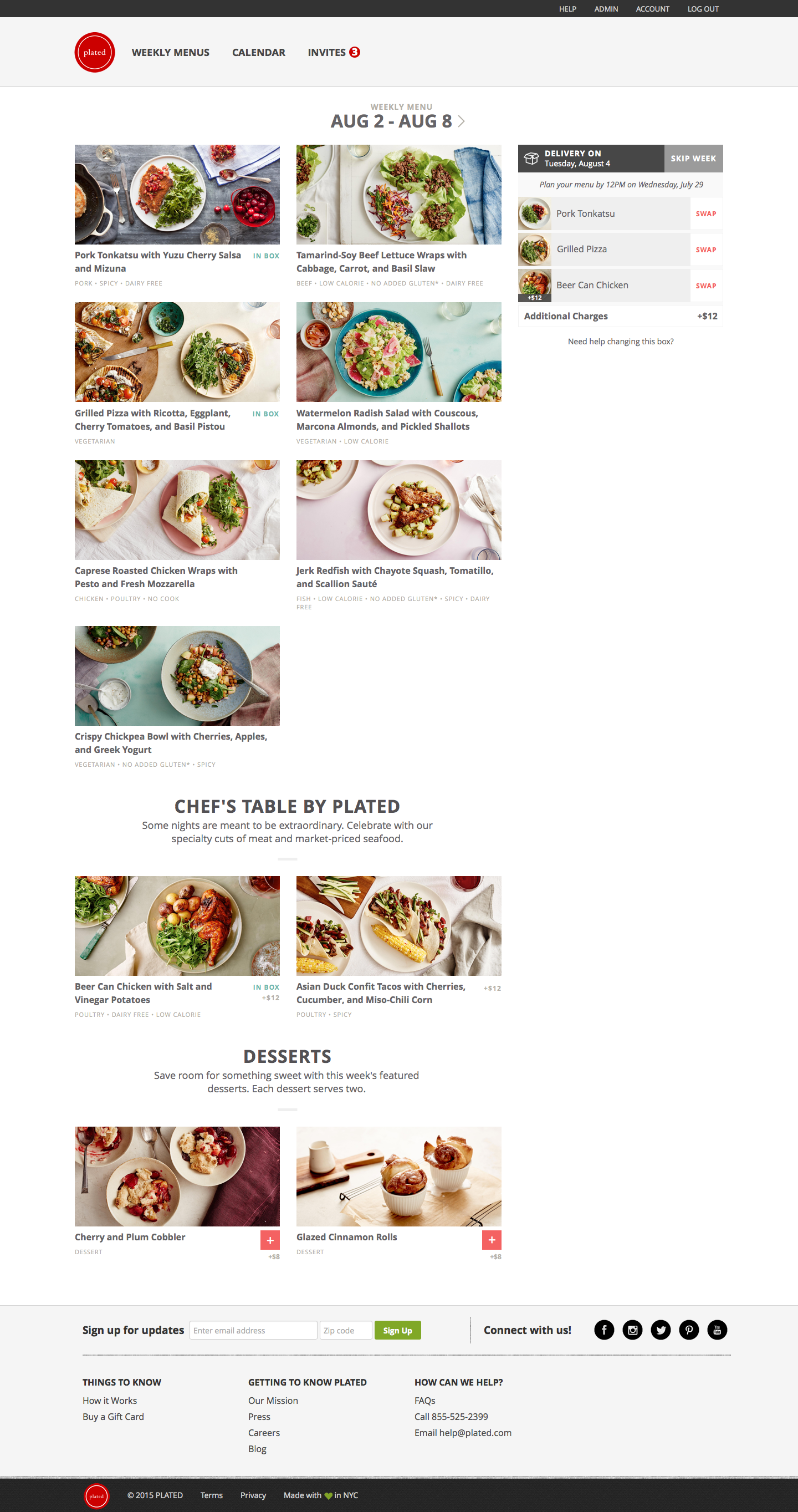
The New Experience: Full Menu Page
Users can quickly get a sense of what is already in their box for a given week, and explore the full menu side-by-side. If a user finds a recipe on the menu they like better, they can swap it into their box in two clicks.
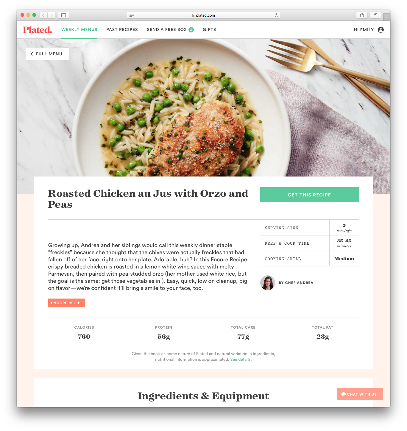
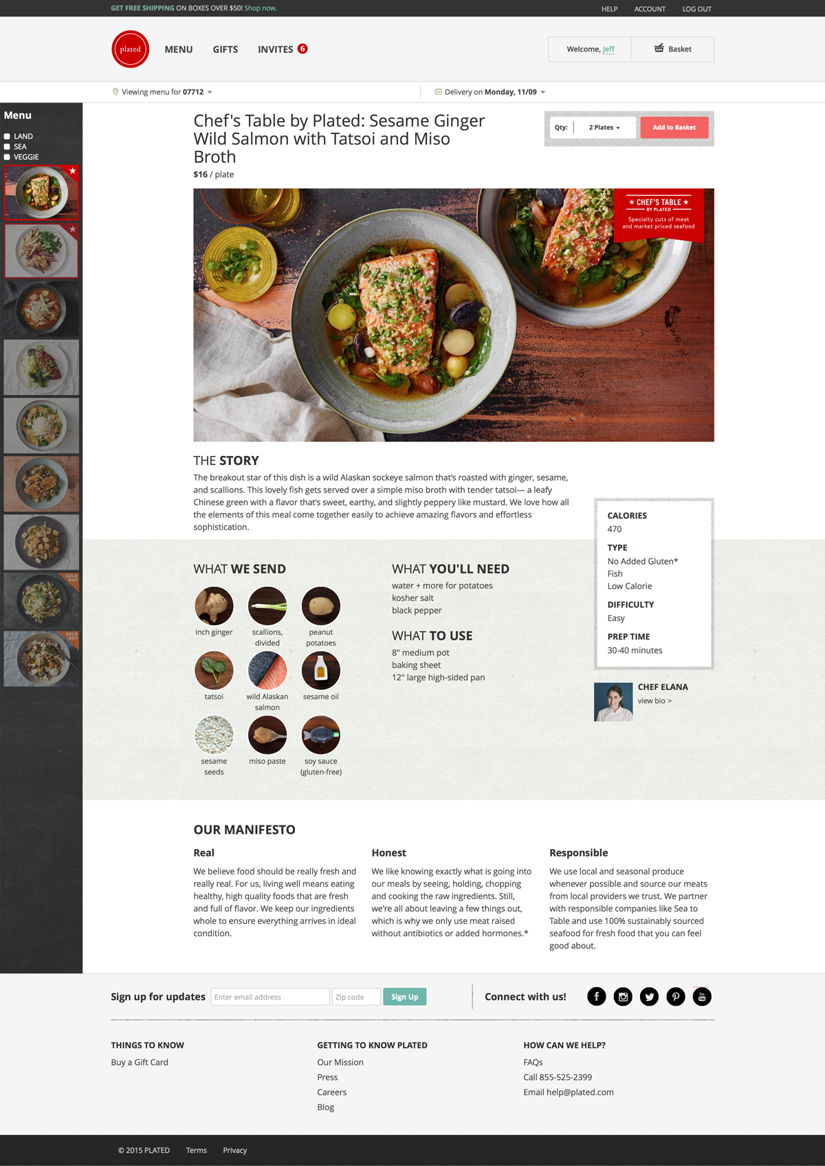
The New Experience: Recipe Detail Page
If a user wanted to explore a recipe in greater detail, they could click a recipe thumbnail and see details like the recipe inspiration, cook time, chef, nutrition info, and a full list of the ingredients and equipment.
After launch, our retention rate went from ~10% of customers still ordering in week 2 of their lifecycle, to 45% of customers still ordering in week 4 of their lifecycle.
We had revived the business, and did so without disrupting our loyal customers. Our retention rate fluctuated week-to-week, but was averaging about 35% (top of the industry) as of my most recent check in 2018.